Atomic Moose
Logo redesign
The Challenge
Redesign a logo for a web design and development shop that had gone on hiatus for over a decade and was looking for a comeback.
The Approach
Identify and document desired attributes of the company brand and required characteristics of the logo. Determine redesign's criteria for success.
Brand Attributes
- professional
- simple
- bold
- dependable
- modern
- serious (atomic) but fun (moose)
Logo Requirements
- must be easy to see at any size
- must be versatile, easily placed into almost any situation regardless of surrounding visuals, colors, etc.
- should reflect "atomic" and "moose" either directly or abstractly
Success Criteria
- reflects all brand attributes
- meets all logo requirements
- is original and unique in its market
The Process
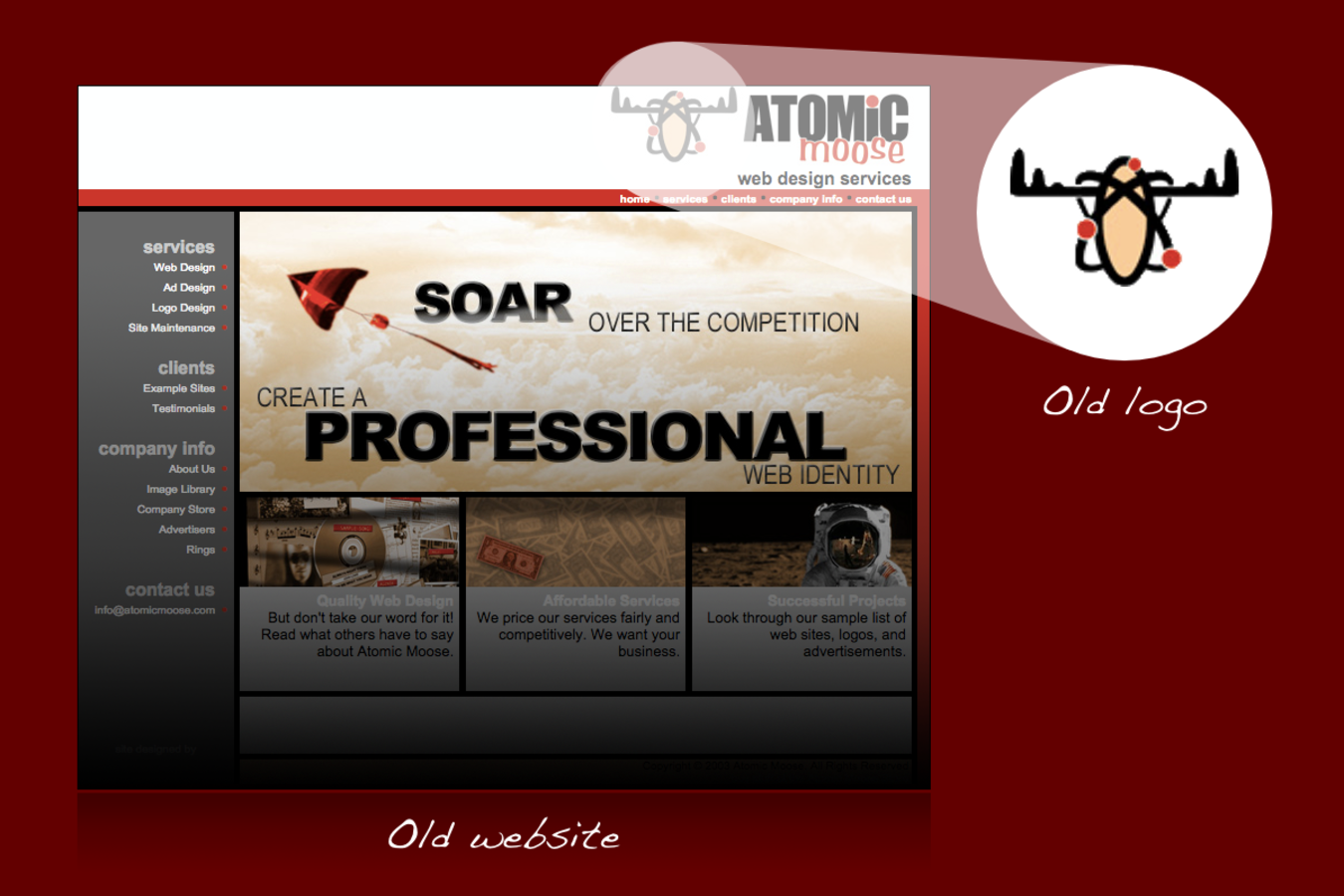
The first design was a simplified version of the original logo, with the shape inspired by the orbits of electrons. However, it was not bold enough, and the "moose" looked more like a bull. Also, a two-color logo is not as versatile as a monochromatic one.
The second design was flatter, bolder, and monochromatic. Again, the shapes were inspired by an atom, this time with more moose than bull. The antlers were aligned with unseen concentric circles suggesting orbits. However, the little electron was too small.

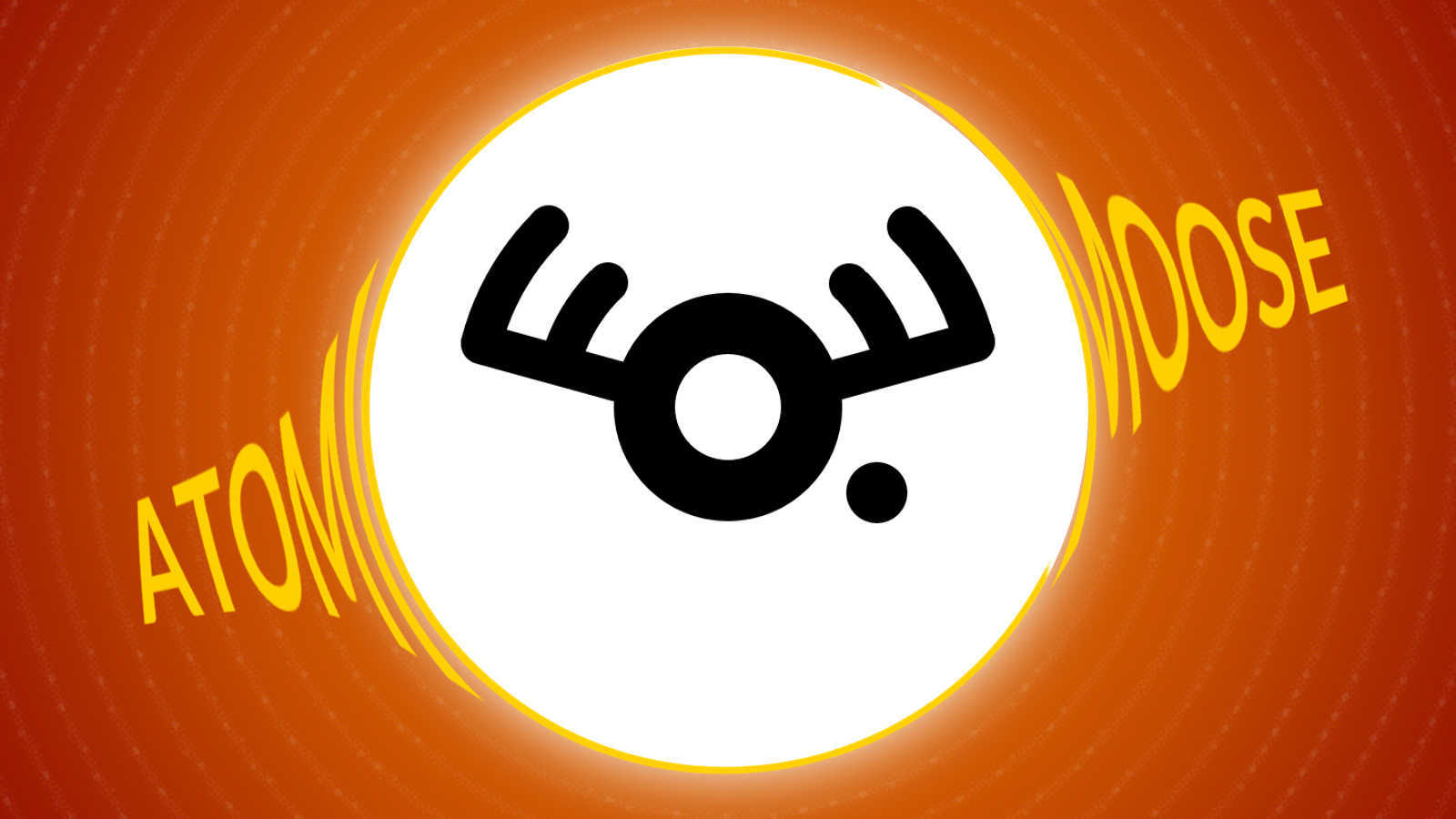
The third and final design was simply a refinement of the second. The little electron was pulled away from the nucleus and given more weight.
The Results
The redesigned logo satisfies all of the success criteria. It reflects each of the brand attributes of the company. The logo is versatile, scalable, and evokes both "atomic" and "moose." Finally, the new design is original and unique.

Have You Hired Me Yet?
What are you waiting for? Email me quick before somebody else does!